Our vision is to lead with trust and create true belonging.
The power of & defines our look — trusted, empowering, and always connecting differences into belonging.
Brand personality
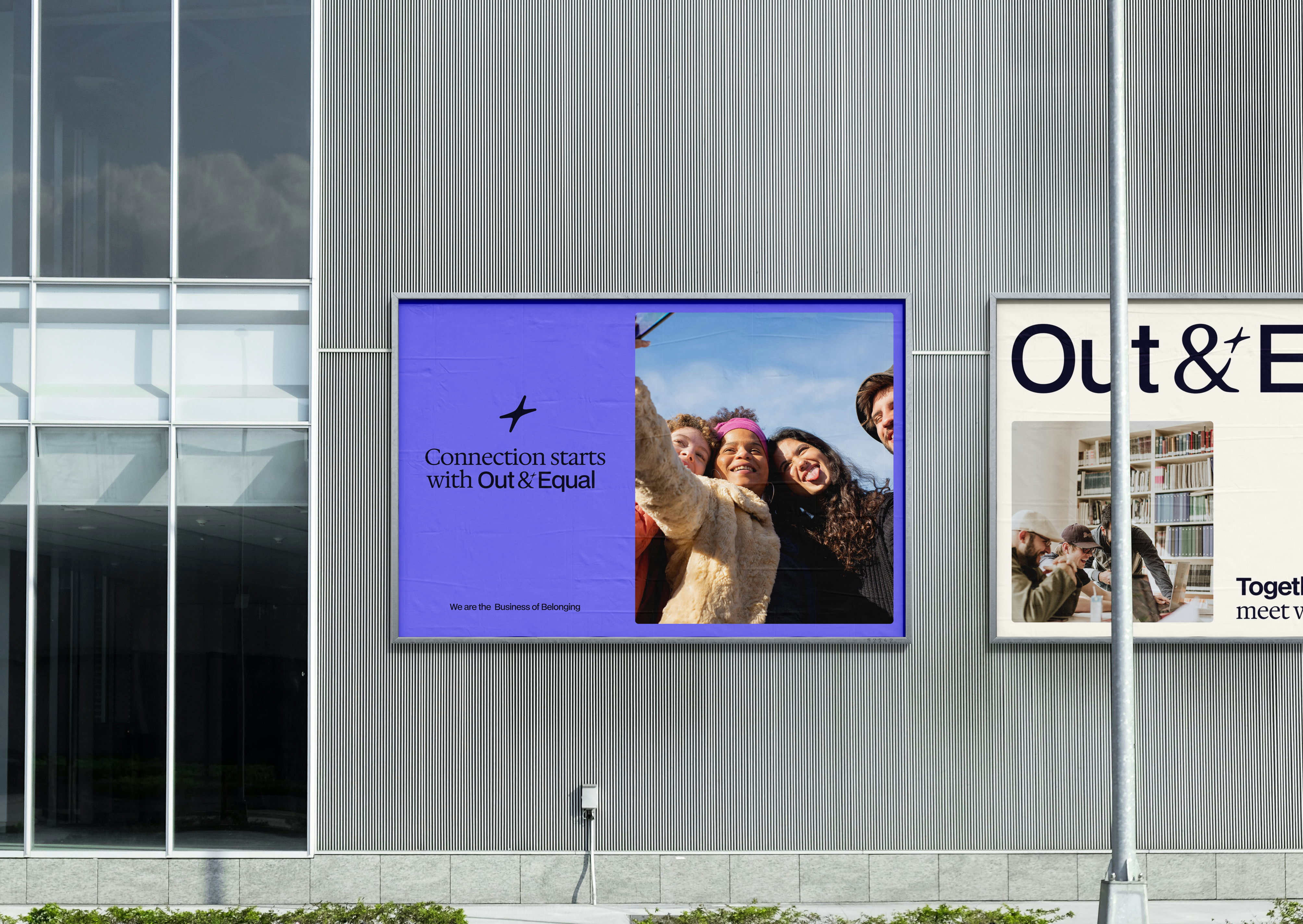
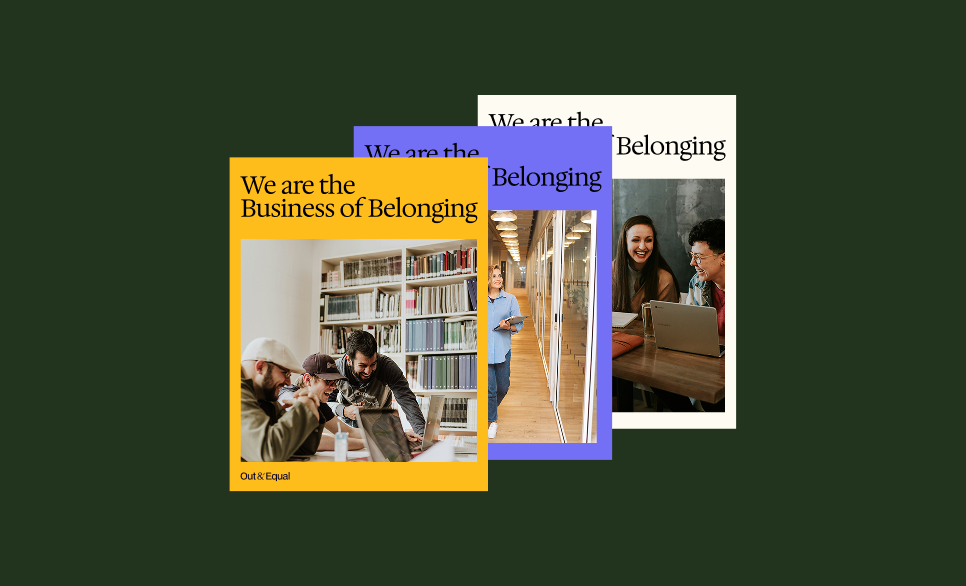
Out & Equal is a brand that celebrates difference while creating connection. Built to belong, Sharp & Steady, and Always connecting, we are empowering without overpowering, trusted without rigidity, and dynamic without chaos. Every visual, interaction, and word carries purpose and direction, subtly guiding people and ideas toward belonging, collaboration, and something greater than the sum of its parts. Our personality is confident, inclusive, and alive — a steady compass in a world that thrives on difference.
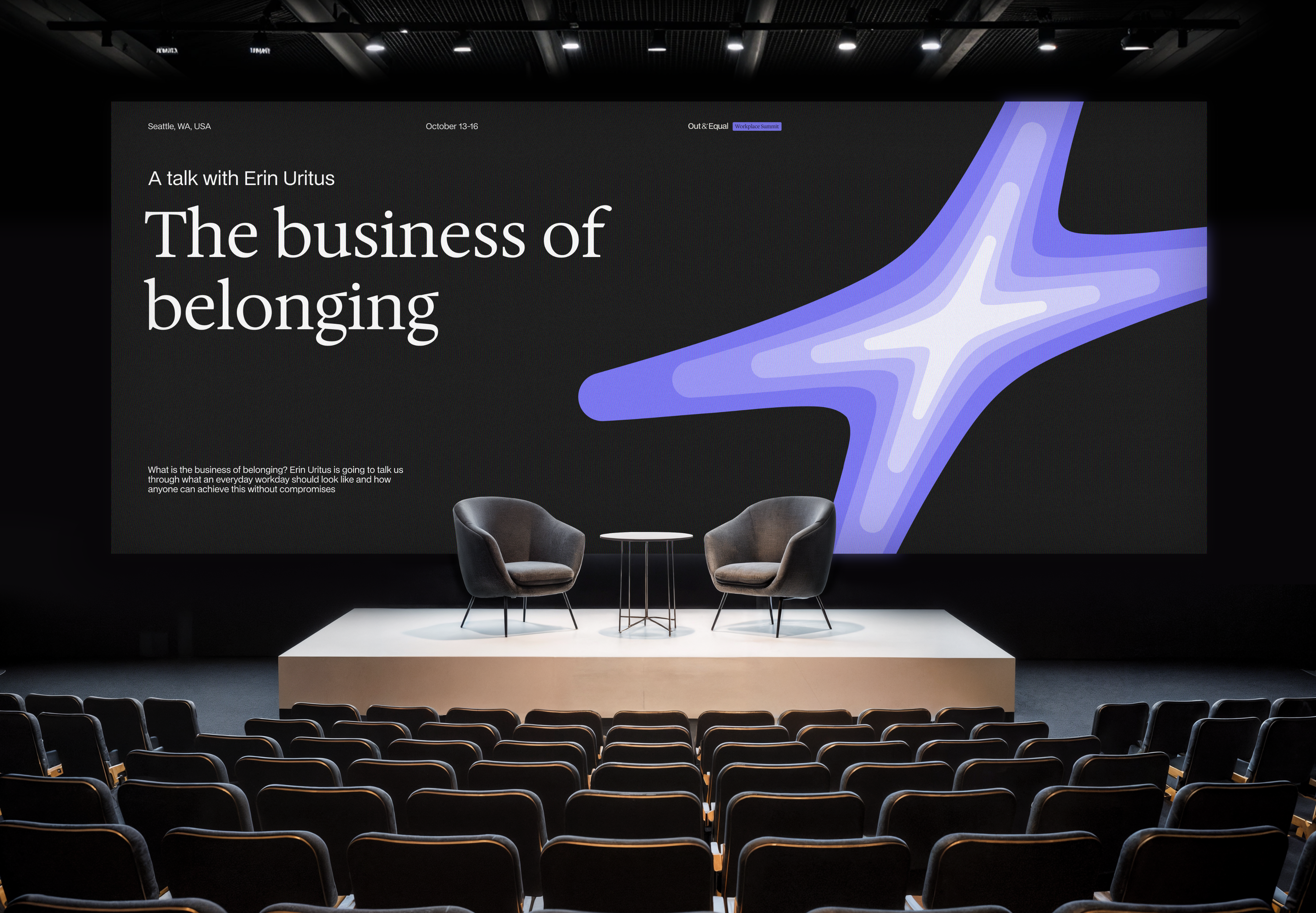
The power of &
Our creative principles guide how Out & Equal expresses its brand visually and verbally. They ensure every choice carries purpose, personality, and connection, shaping work that feels empowering, confident, and alive without saying it outright.

Creative principles
Our creative principles guide how Out & Equal expresses its brand visually and verbally. They ensure every choice carries purpose, personality, and connection, shaping work that feels empowering, confident, and alive without saying it outright.
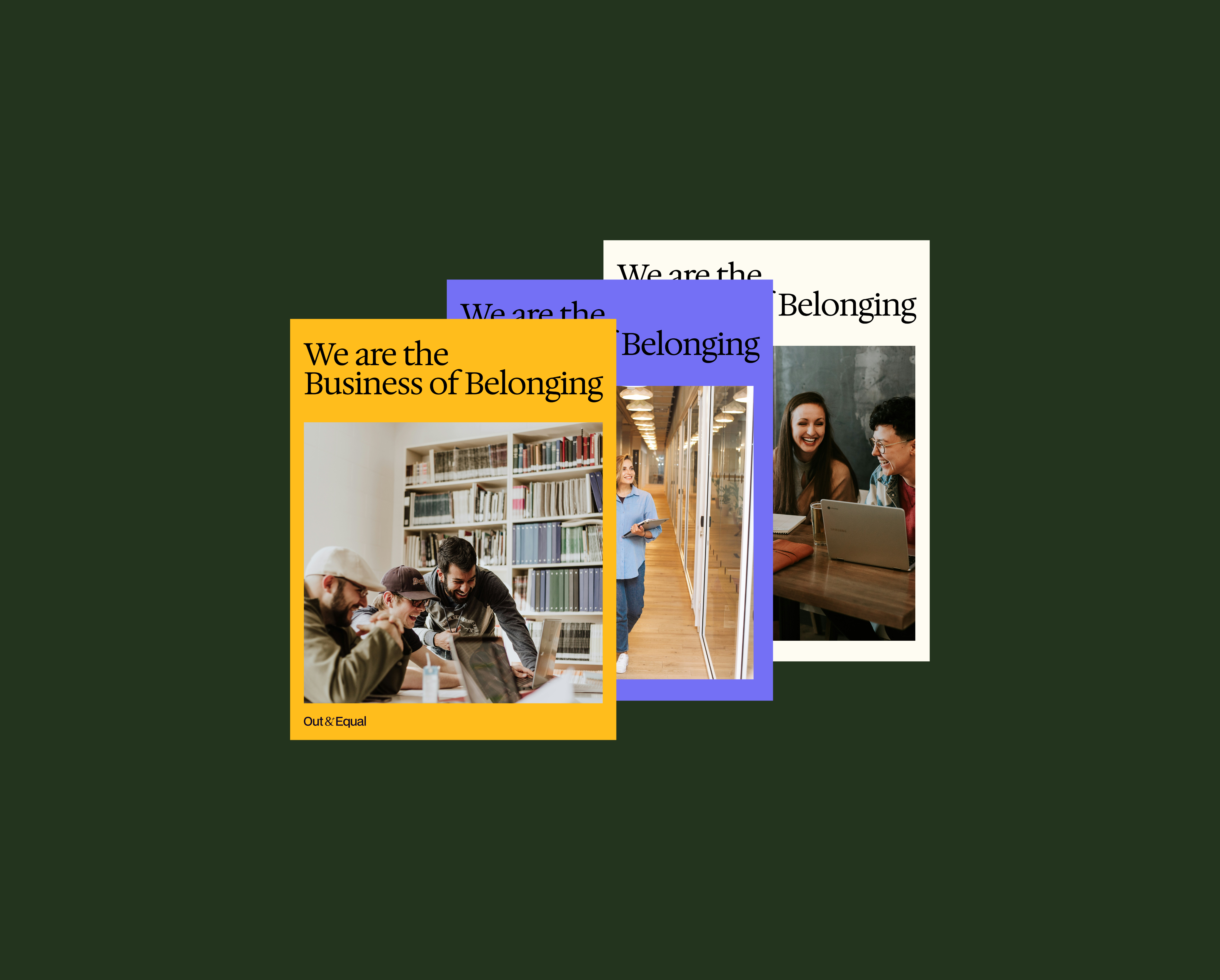
Built to belong
Our creative principles guide how Out & Equal expresses its brand visually and verbally. They ensure every choice carries purpose, personality, and connection, shaping work that feels empowering, confident, and alive without saying it outright.
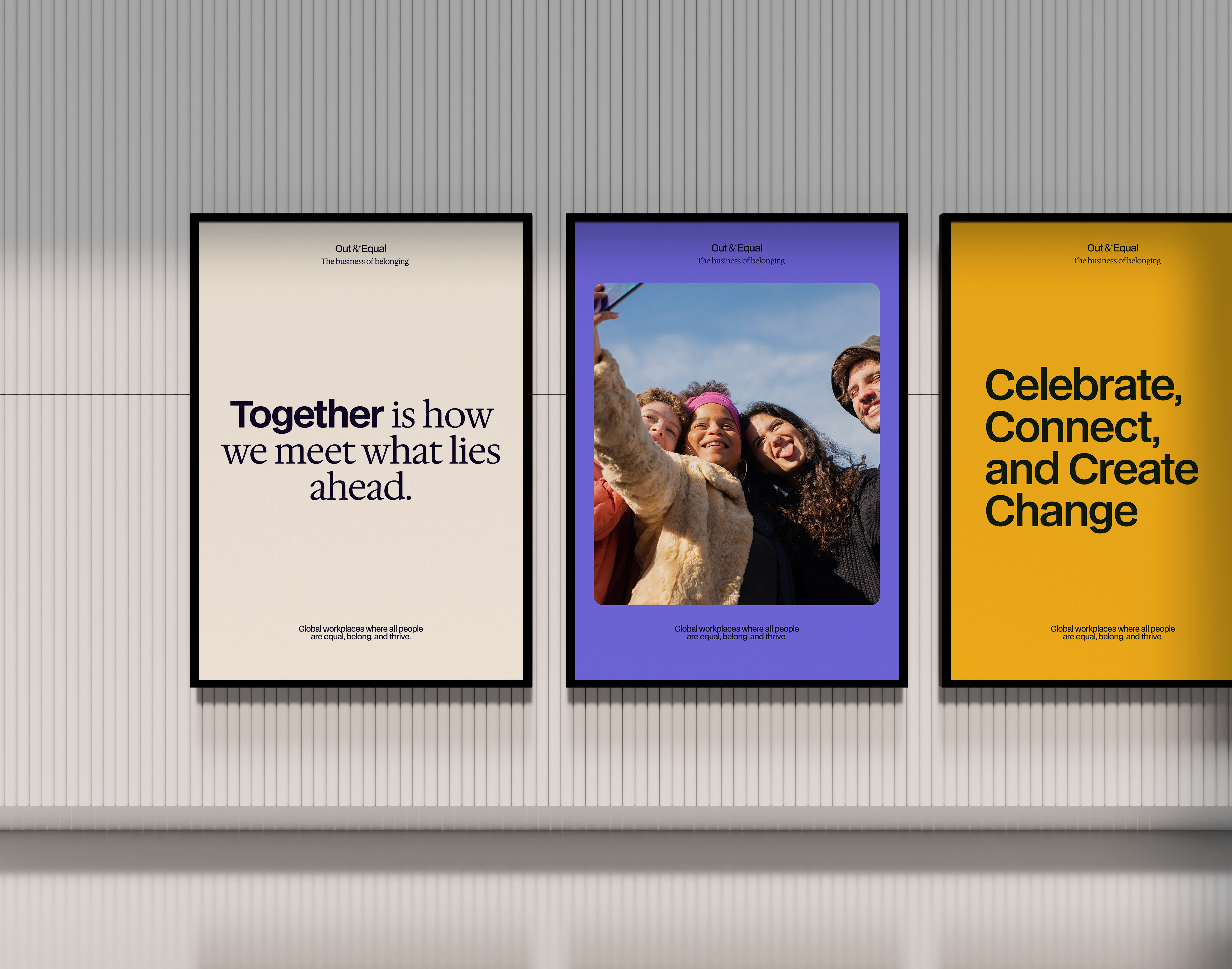
Sharp & Steady
Clarity, precision, and thoughtful balance underpin our visuals. From color to type to hierarchy, our work is confident and reliable, grounded in purpose while flexible enough to adapt to every context.
Always connecting
Connection flows through every interaction. Our designs link people, ideas, and experiences, creating movement, relationships, and a sense of shared purpose that invites participation and belonging.